> ## Documentation Index
> Fetch the complete documentation index at: https://wb-21fd5541-docs-1778-mysql-updates.mintlify.site/llms.txt
> Use this file to discover all available pages before exploring further.
# Scatter plots
This page shows how to use scatter plots in W\&B.
## Use case
Use scatter plots to compare multiple runs and visualize the performance of an experiment:
* Plot lines for minimum, maximum, and average values.
* Customize metadata tooltips.
* Control point colors.
* Adjust axis ranges.
* Use a log scale for the axes.
## Example
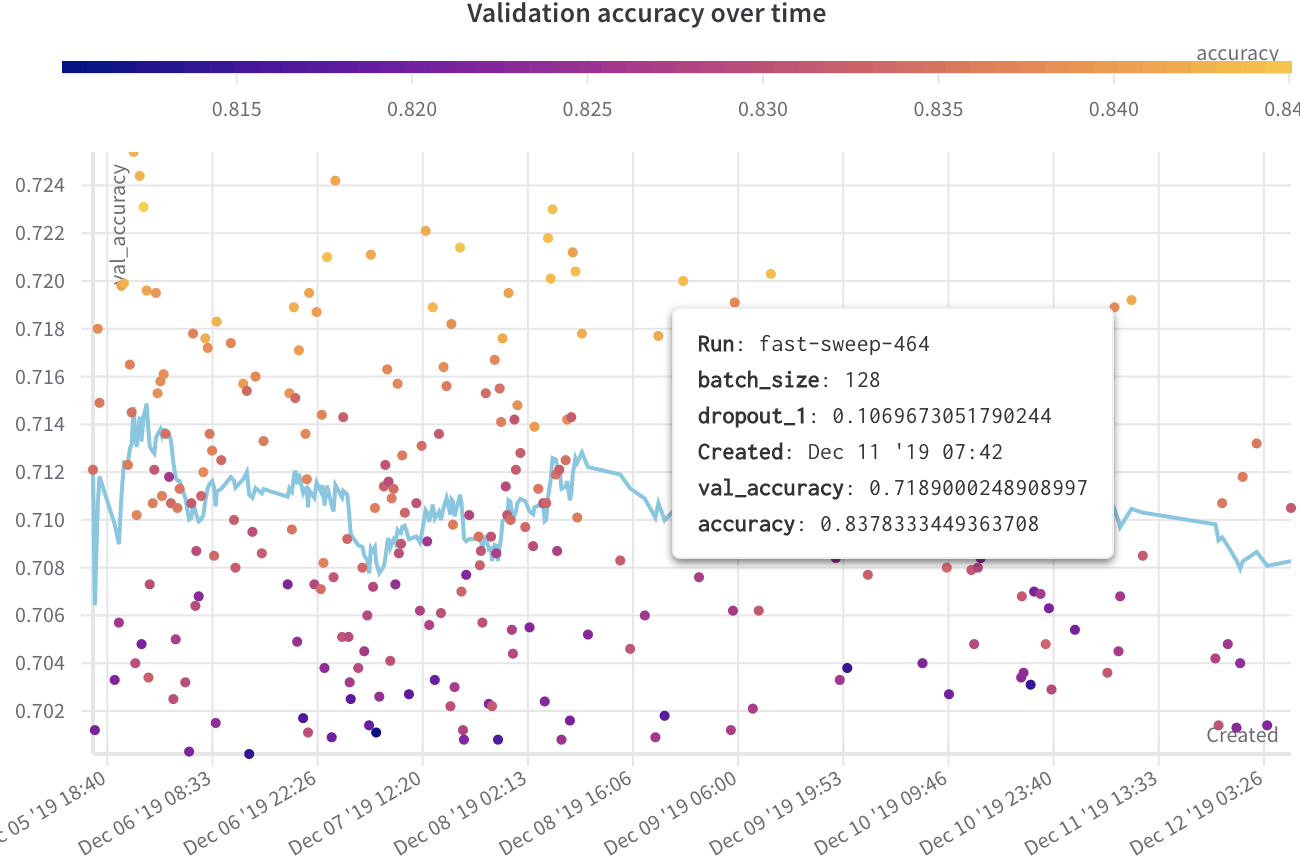
The following example shows a scatter plot displaying validation accuracy for different models over several weeks of experimentation. The tooltip includes batch size, dropout, and axis values. A line also shows the running average of validation accuracy.
[See a live example →](https://app.wandb.ai/l2k2/l2k/reports?view=carey%2FScatter%20Plot)
 ## Create a scatter plot
To create a scatter plot in the W\&B UI:
1. Navigate to the **Workspaces** tab.
2. In the **Charts** panel, click the action menu `...`.
3. From the pop-up menu, select **Add panels**.
4. In the **Add panels** menu, select **Scatter plot**.
5. Set the `x` and `y` axes to plot the data you want to view. Optionally, set maximum and minimum ranges for your axes or add a `z` axis.
6. Click **Apply** to create the scatter plot.
7. View the new scatter plot in the Charts panel.
## Create a scatter plot
To create a scatter plot in the W\&B UI:
1. Navigate to the **Workspaces** tab.
2. In the **Charts** panel, click the action menu `...`.
3. From the pop-up menu, select **Add panels**.
4. In the **Add panels** menu, select **Scatter plot**.
5. Set the `x` and `y` axes to plot the data you want to view. Optionally, set maximum and minimum ranges for your axes or add a `z` axis.
6. Click **Apply** to create the scatter plot.
7. View the new scatter plot in the Charts panel.